
callback

Landing Page is a one-page marketing site designed to promote your products and skillss on the Internet. It is a personal manager who will advantage the product instead of you day and night.
The main purpose of this site is to convince a potential customer to make an order by leaving a request on your site. We will help you create beautiful, user-friendly, and above all, profitable page.
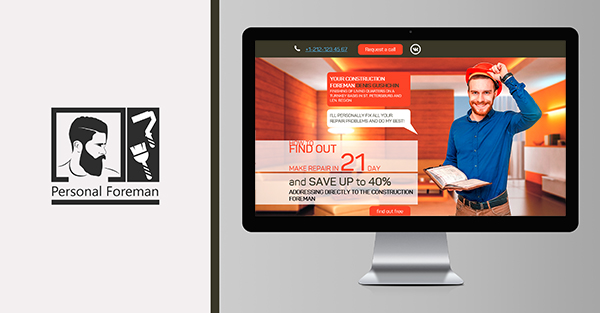
This order was received from a repairman, whose goal was to create a website with all his advantages shown and convincing the client to choose him. We decided to develop a Landing page bringing all the necessary information and increasing the number of requests.
On home page, the user sees the representative of the company and the benefits available.
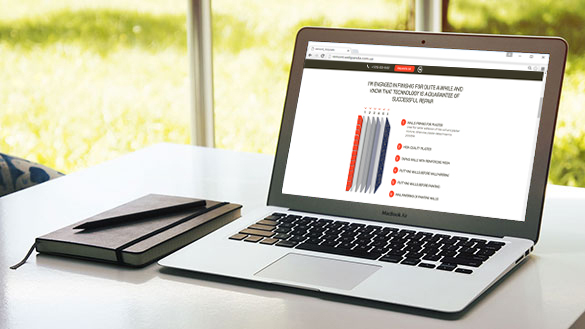
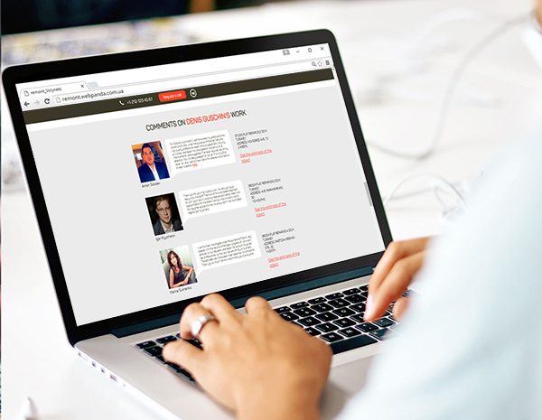
Further appears the information on the skillss with minimalistic design. After scrolling, the user can learn about the work and ensure the reliability of cooperation.

Business card website is an online presentation for your company. This kind of site usually contains from one to five pages with information about the company: images, description of goods, skillss and contact information. This site is like the business card of the company, but more detailed, aimed to present your company in a best way.
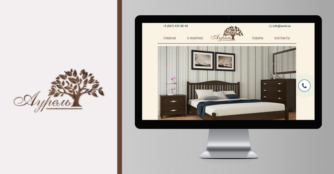
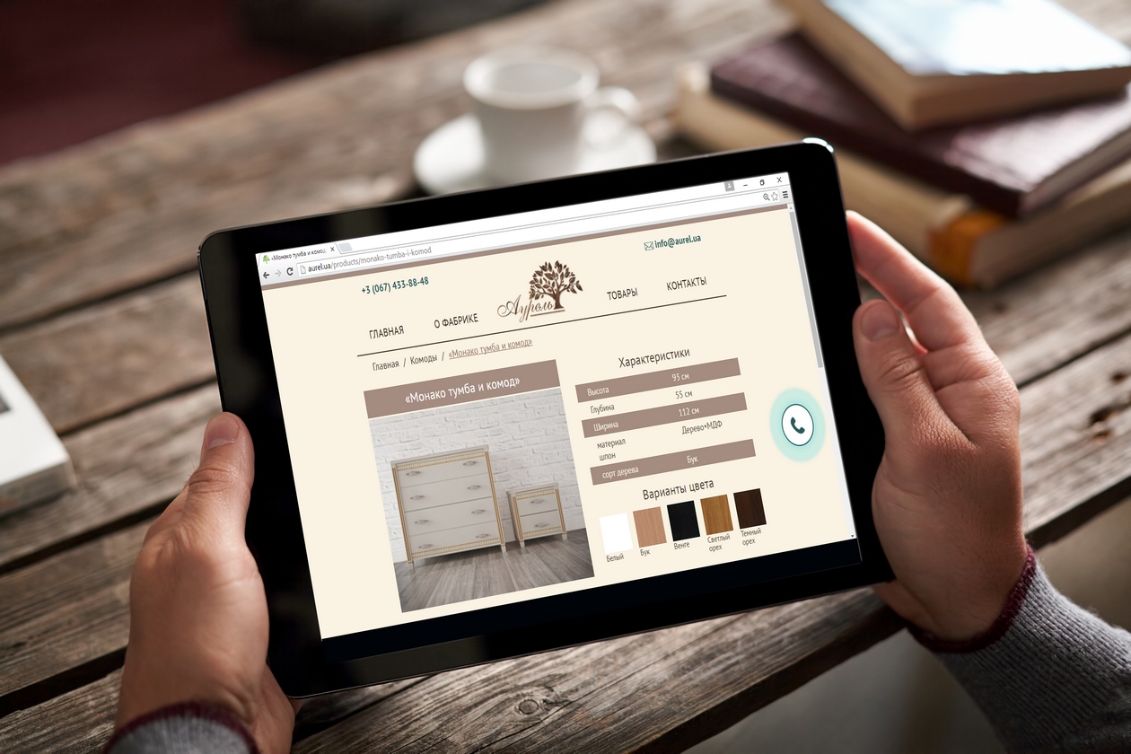
Aurel Furniture Factory has proven itself as a stable company able to produce comfortable and practical furniture. Our goal was to create a simple but impressive business card site, which could show the work of the factory at its best.
Once on the home page, the user can immediately mark capabilities of the company, thanks to the large banner.
A small menu in the header reduces the search for necessary information. The compactness and simplicity of the good cards allows placing an order quickly and easily choosing desired color and configuration of the product.
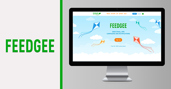
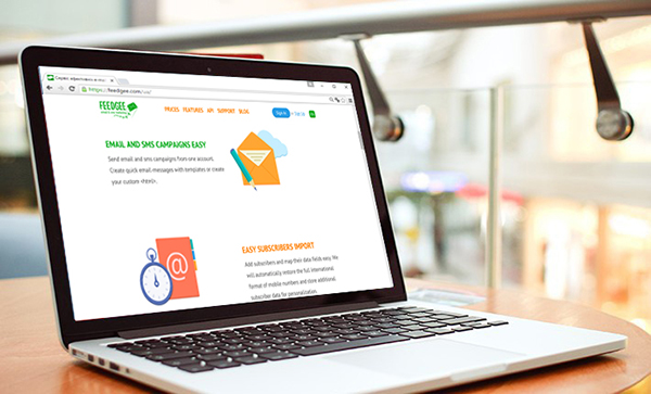
Modern trends require special attention to the information that the customers see. That is why it should not only be clear and competent, but also visually pleasing. We have developed beautiful and light site for Feedgee. Animation allowed combining the informational content with the ease of perception. Various additional colors supplemented logo coloristic.
The site includes a fixed header, which makes its usage easier.
The most important thing here is the interest, that user feels visiting this vibrant and active website. He will definitely read all information to the end of the page.

Corporate websites are multi-page sites with information about the company’s functions. It is designed in a corporate style which strictly follows the line of your company’s work.
Corporate sites generally cover regional intercommunication. For instance, when customers from different regions make an order, their geographical position is taken into account.
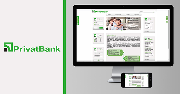
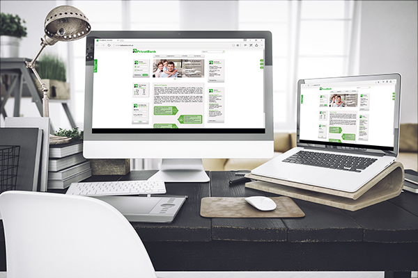
Privat Bank is one of the largest banks in Ukraine. We developed a website that would meet all the requirements of the company. The key features of the site are the simplicity and clarity.
Following the corporate identity, we used green and grey colors.
Convenient arrangement of important components.
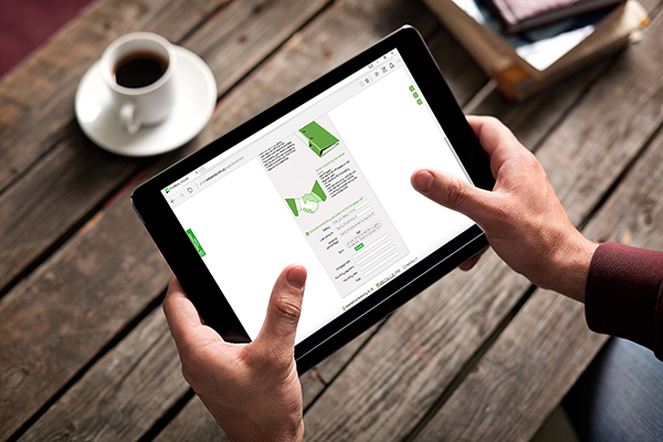
Feedback opportunity has been presented.
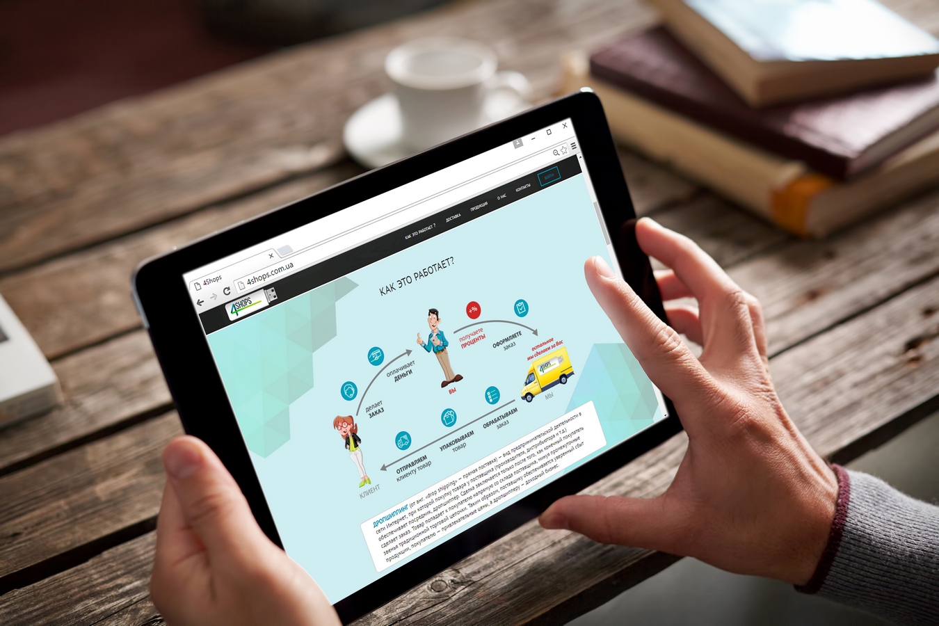
For 4shops website we used infographic reducing the amount of information, which greatly simplified the perception of the site. Every minute counts for customers who carry out transfers. For this reason, we tried to replace text with visual information.
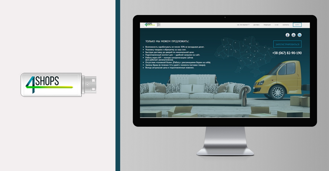
A large banner background on the home page shows the user that he got on the transportation carrier’s website.
Going forward we have clearly defined what are the benefits of the company in an understandable and enjoyable way for the customer. Footer is made in a minimalistic style.

Online store is a multi-page site to provide goods and skillss on the Internet. It is a well-known fact that sales online expand the customers’ base from your city to other countries.
Website header contains the most important information, allowing reducing time searching the necessary data.
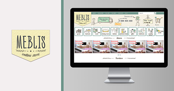
A creative approach was used to develop Meblis website. Unusual logo allowed distinguishing the company from its main competitors. We did not disturb the basic style of the logo, so a website is developed with icons in the style of drawings.
Each section has a clear and simple visual character. Dimmed colors bring lightness and calmness.
Self-scrolling banners allow informing users about current discounts and special offers.
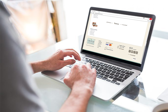
Footer is made in a minimalistic style, with icons like drawings.
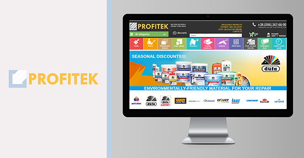
Colorful company website Profitek combines the brightness, creativity and modernity. Since the company Profitek sells building materials of a wide spectrum, the site menu is divided into several categories. It was important to separate them visually. That is why we have identified each menu item with a complementary color.
Slide with trademarks allows navigating quickly to a class of products sold.
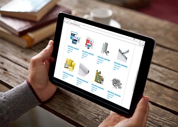
Cards with a brief description of the goods can reduce the time searching for the required section. Footer is made in a minimalistic style.
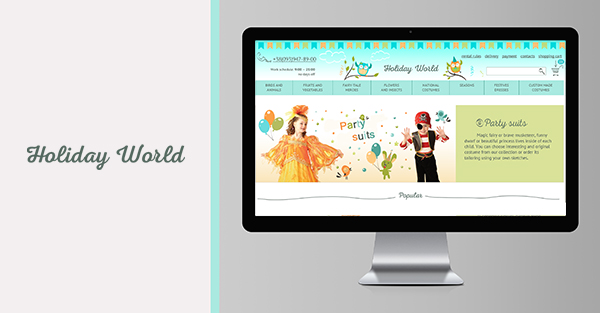
Modern and bright website for kids’ holiday costumes company conveys its concept and the festive atmosphere.
Header is made in a cartoon style with minimalism. To emphasize the company’s line, we have added illustrations of two little owls.
Below is a banner with a photo presentation of the product and a brief description of the product range.
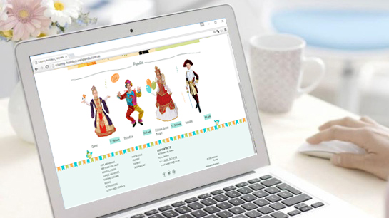
We have added the possibility to view the most popular products of the company, so that the client could immediately see the sales hits. Footer is designed in minimalistic style.

Responsive websites Responsive sites adjust and fit into window size of electronic device, considering zooming. The main advantage of these sites is correct page view on different monitors without losing readability.
CALLBACK: